So what if the title is a supremely lazy pun on the combined facts that this painting is predominantly blue and that it is Sunday? I unfortunately was not blessed with Leslie Knope's (Amy Poehler's character from the fantabulous television show, Parks and Recreation) inexplicable gift for witty headline generation. It's just a fact of the matter: today IS Sunday! A lovely day full of peace, relaxation, and promise for the new week. I have something coming up quickly on Monday that will hopefully bring for me a great opportunity, and in times like this, I realize just how special Sundays can be. Just think about all of the Sundays that you have spent studying frantically for a test, trying to gather as much information as possible for a big project that you have to start the next day, or just trying to get as much rest as you can to prepare you for the hectic week that you know lies ahead. I just hope that you can take a moment to be thankful for this little knot of emotion that we all feel on Sundays. It means that we're alive and taking an active role in this world. There's always more to do, more to see, and more to feel, and we should see this for the blessing that it really is.
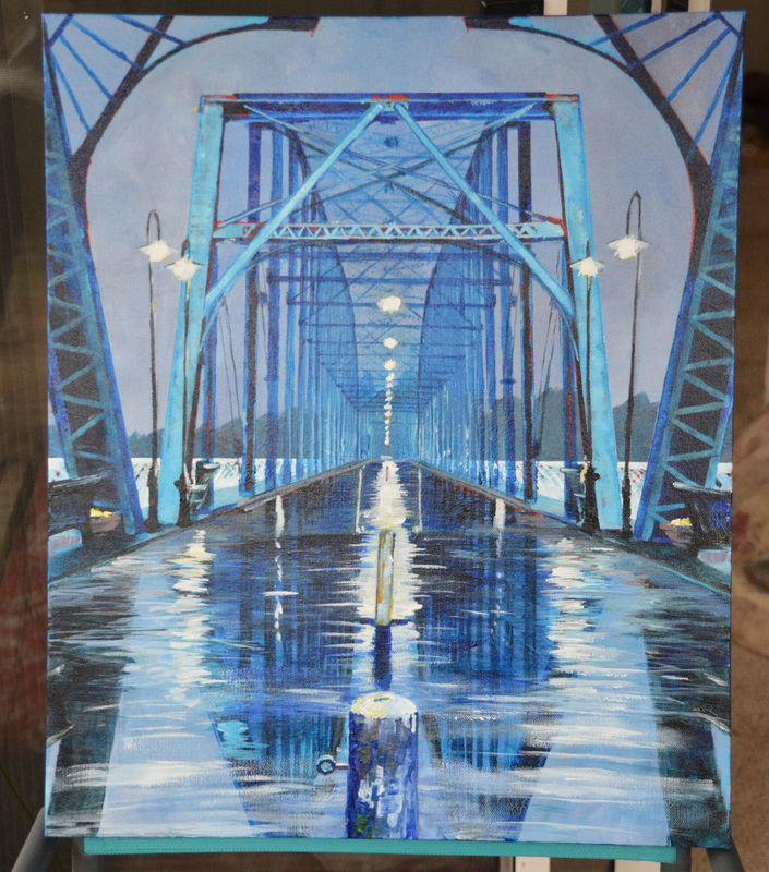
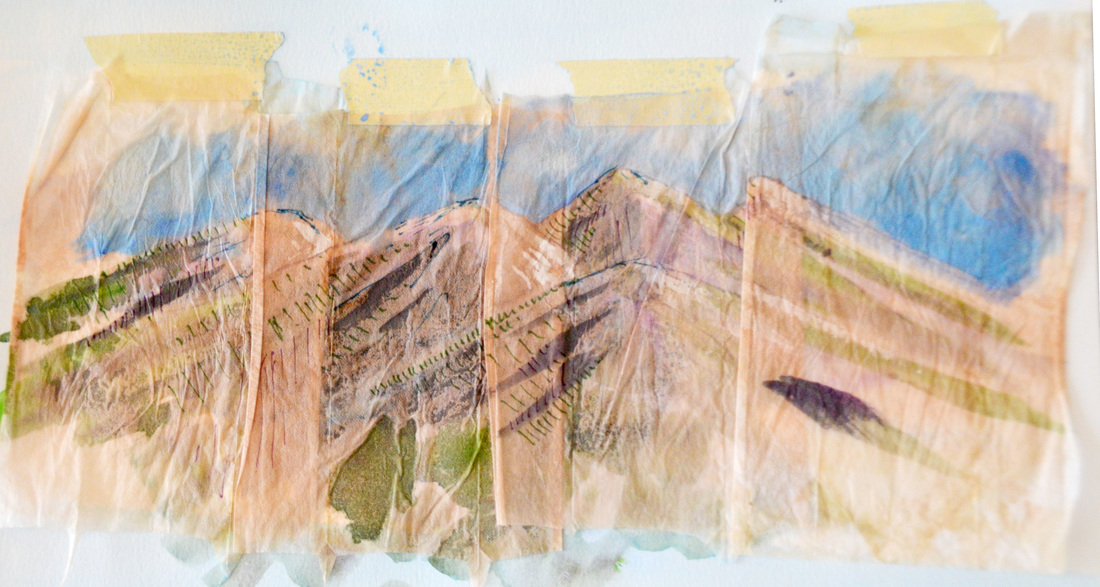
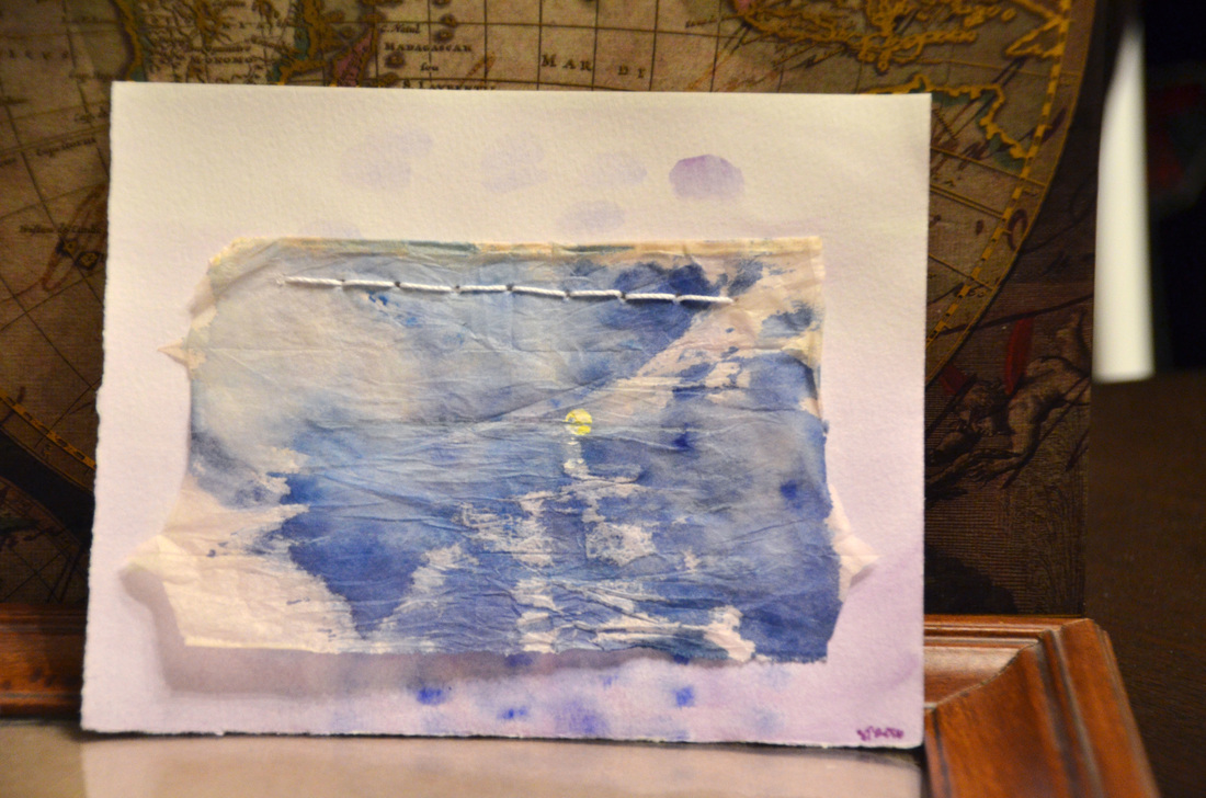
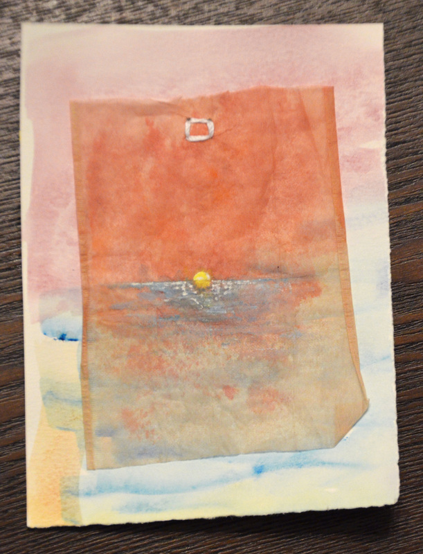
Tirade aside, that's fact one. Fact two is that this painting IS predominantly blue, and the subject is absolutely gorgeous! This painting was done for my good friend Courtney: newly indoctrinated Civil Engineer, Cell Phone Photographer Extraordinaire, and awesome all-around gal! She's always been one of the smartest people I know, and lately I've learned of her amazing knack for taking beautiful photographs, which was one inspiration for this painting. Recently she has graduated from college and made one of the first big steps in her new life, so I wanted to make something for her to celebrate that! (And I won't lie, part of the deal is that I get a print of one of her awesome photographs taken during one of our hiking adventures, which I am SUPREMELY excited about.) As for the subject of the painting, there is a bridge in Chattanooga at which she loves to hang out, and she has also taken a good number of her fabulous pictures of it, so we decided to use one of those for her painting!
Tirade aside, that's fact one. Fact two is that this painting IS predominantly blue, and the subject is absolutely gorgeous! This painting was done for my good friend Courtney: newly indoctrinated Civil Engineer, Cell Phone Photographer Extraordinaire, and awesome all-around gal! She's always been one of the smartest people I know, and lately I've learned of her amazing knack for taking beautiful photographs, which was one inspiration for this painting. Recently she has graduated from college and made one of the first big steps in her new life, so I wanted to make something for her to celebrate that! (And I won't lie, part of the deal is that I get a print of one of her awesome photographs taken during one of our hiking adventures, which I am SUPREMELY excited about.) As for the subject of the painting, there is a bridge in Chattanooga at which she loves to hang out, and she has also taken a good number of her fabulous pictures of it, so we decided to use one of those for her painting!
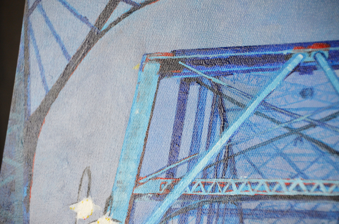
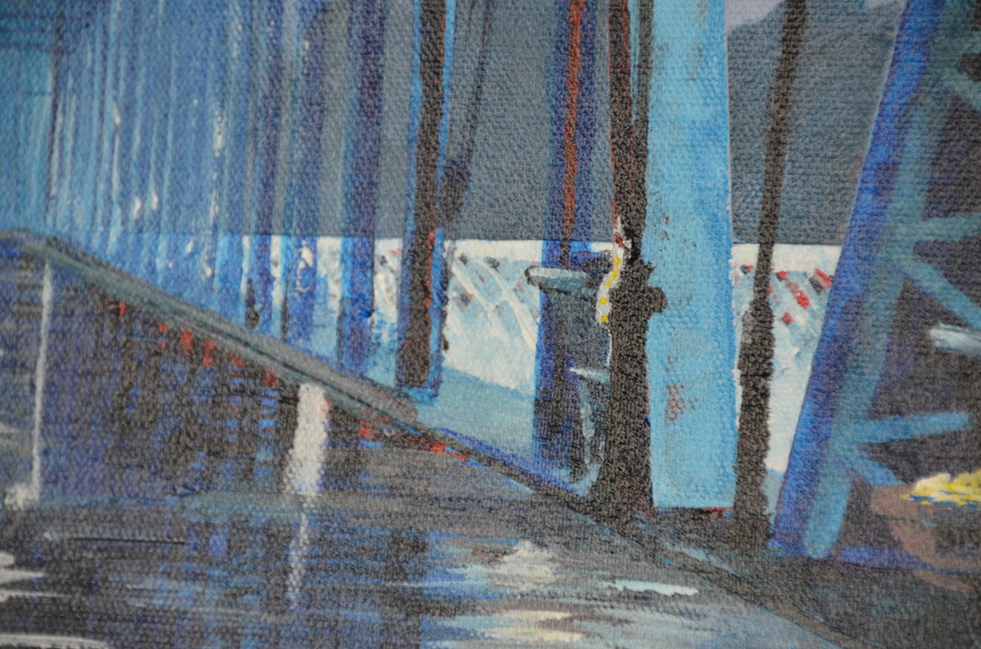
As you may know, I am not the best at drawing architecture. Precise lines and such aren't impossible for me, but they certainly represent a challenge. I chose to approach this attempt by using more of a loose style and (gasp!) by not starting out with a drawing? Sacré bleu!!!*
Yes, that's right, I did just start out by slathering paint everywhere, which was a first for me, and definitely an interesting experience. The loose style was also a challenge, especially with the precise nature of the subject. I will admit, though, that there was another reason for this. Recently, I have been seeing the colors turquoise and red together more and more frequently, and I have become mildly obsessed with the combination. They just look so gorgeous together! And with the Turquoise color of the bridge and the expectation that there is wear and patina on older structures, I just couldn't pass up the opportunity to use that palette.
Yes, that's right, I did just start out by slathering paint everywhere, which was a first for me, and definitely an interesting experience. The loose style was also a challenge, especially with the precise nature of the subject. I will admit, though, that there was another reason for this. Recently, I have been seeing the colors turquoise and red together more and more frequently, and I have become mildly obsessed with the combination. They just look so gorgeous together! And with the Turquoise color of the bridge and the expectation that there is wear and patina on older structures, I just couldn't pass up the opportunity to use that palette.
...which brings up yet ANOTHER newer aspect of my work that I've been trying to emphasize. It's incredibly common for artists to have a color palette in mind when they are working on a project. In fact, it's almost required. And it's something that I have always struggled with. I tend to get a little carried away as I start painting or coloring, and forgetting about the palette more quickly than I can even get on the underpainting. Lately, however, it's been something I've been doing my best to focus on, and make a priority, and I feel that it's paying off! It may seem absolutely ridiculous to some that this is an issue for anyone who considers themselves even an amateur artist. It's sort of like advocating that you're a chef while having no idea how to boil water. I'm coming to the realization, though, that it's never too late. If I let my embarrassment for not being better at this drive me to show my work or even make art less, then I wouldn't get anywhere. But when I get past it (and I will, don't you worry), I'll be an even stronger artist for it, as well as a stronger person for working through it. That's living, and that's life.
Considering that I'm still quite young and close to the beginning of my journey as a person and an artist, I'm attempting to try as many different styles, techniques, and approaches as possible with each new project, to varying levels of success. I feel that this painting was one of the better ones I've done as of late, so I'm excited about sharing it with Courtney and with all of you!
Thanks!
Sarah
*If you caught this as another bad pun about the color blue, bravo.

 RSS Feed
